There are times in every designer's life when you're in the right place at the right time. When my former Art Director at Traveler magazine (plus mentor and all-around great guy), Bob Gray, called me to offer a unique freelance gig, I jumped right on it.
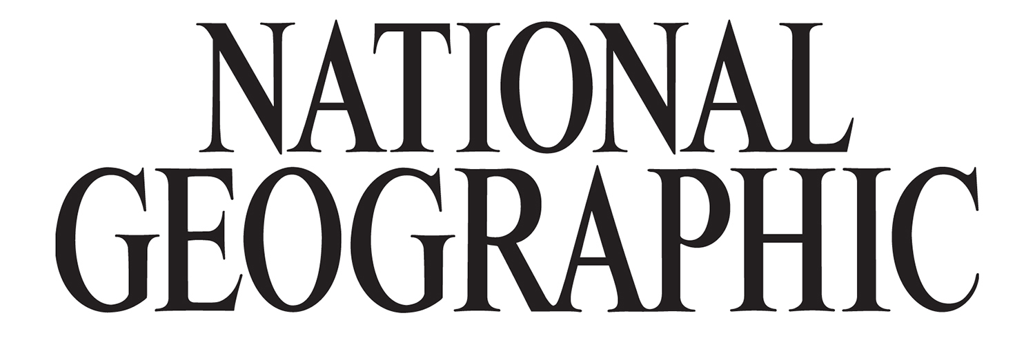
National Geographic magazine had decided to update its cover logo (nameplate). From 1960 to 2000 the logo included two versions of the same font. The word NATIONAL appeared at Bartuska's normal font height. GEOGRAPHIC was elongated vertically.

the original
Bob and the rest of the design team at NGM, including Betty Clayman, typographic guru extraordinaire, wanted to unite the logo using the same font treatment. We met several times. At each meeting we thoroughly dissected the ligatures, serifs, line thicknesses, and weighed versions of each to find the most visually pleasing.
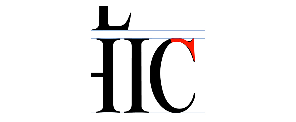
one of the many adjustments
I am a type nut, so the process of refining the logo was pure joy for me. When we finalized the type, it looked like this:
the new logo
The magazine has been using this version ever since.